Expression For Growth

GLOBAL LEADERS IN COMMERCIAL CAPABILITY
Expression For Growth are world leaders in global commercial training, providing solutions for multi-national corporations to drive behavioural and cultural change.
As a business they had matured and grown considerably since their initial branding, and now required a revamp of their primary brand and product branding, aligning with their new position in the global training solutions market.
This would turn out to be one of our most comprehensive branding projects to date, with two identities and a multitude of collateral to create!
Services
- Brand & Identity
Industries
- Professional Services
overview
A unique and comprehensive project for Giant Peach from a branding perspective, our brief was to rebrand not only Expression For Growth’s primary identity, but to simultaneously rebrand their training solutions identity; Precision.
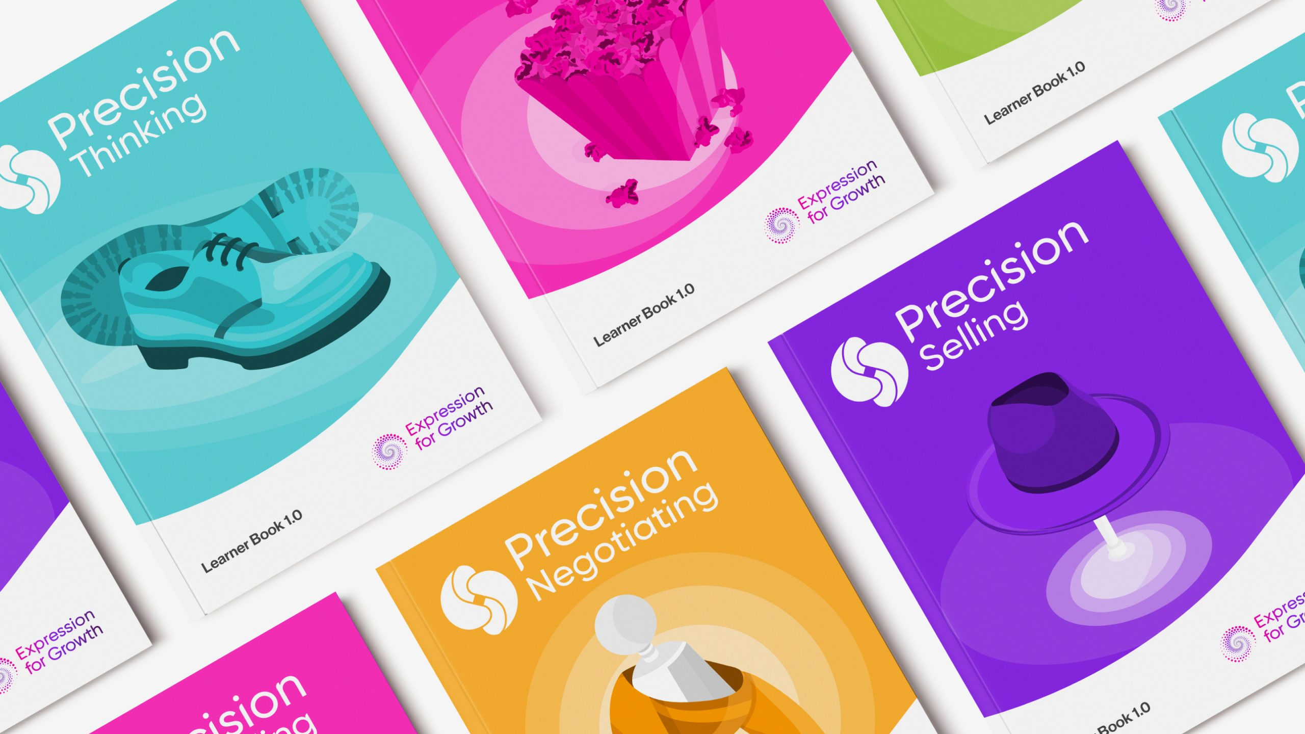
The goal for Precision was to become its own brand in itself, standing independently of Expression For Growth. Precision’s five training solutions sit underneath the overarching brand, each with a consistent look and feel.
brand process
Giant Peach focussed on the design of the Precision identity to initiate the project, with the aims of the Expression For Growth identity following suit once a preferred concept had been chosen.
initial design
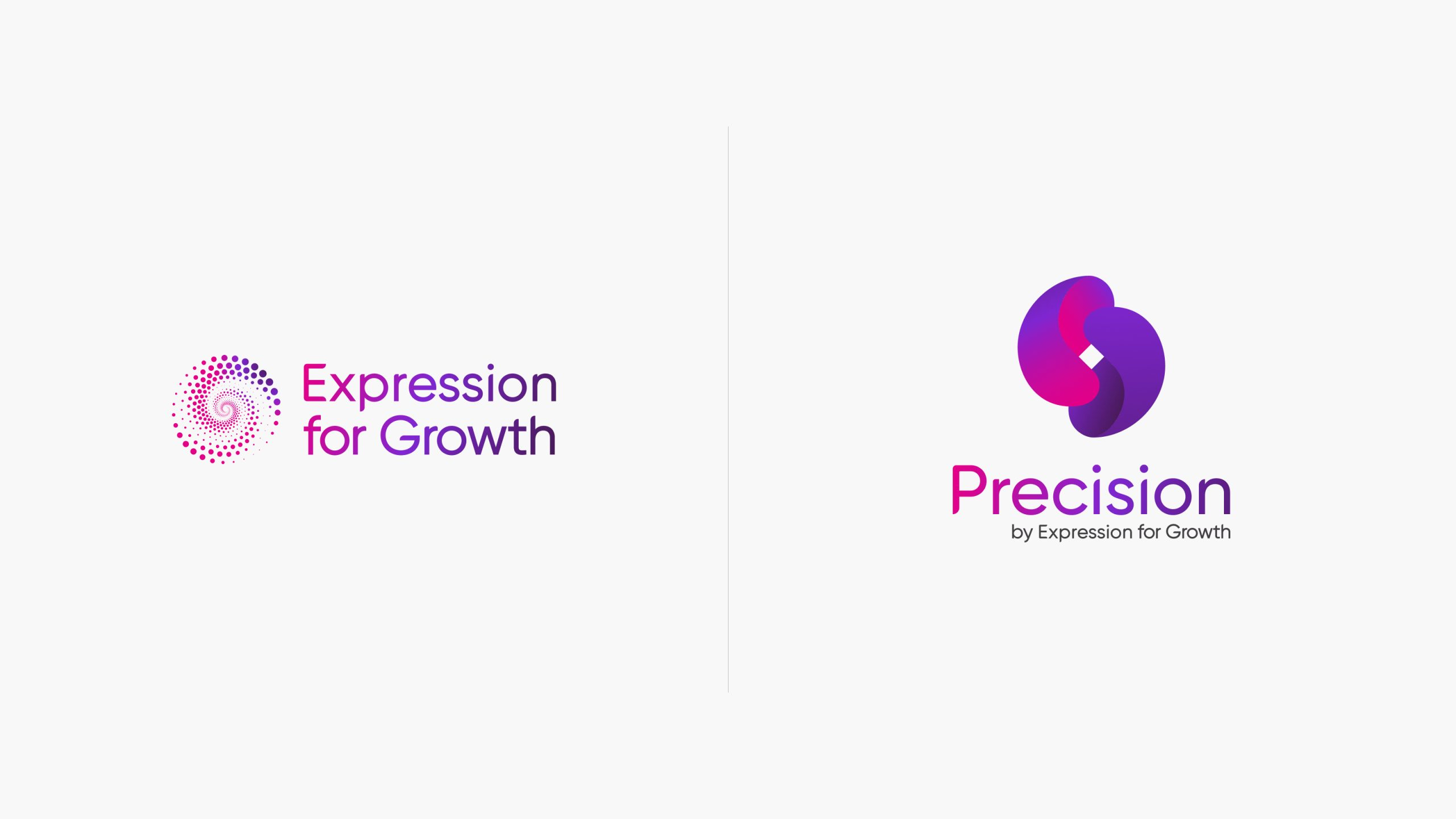
We took to pen and paper and started sketching the bones of three initial design concepts, drawing on overarching themes of human experience and connection, fluidity, dynamism, energy, vibrancy and a subtle playfulness whilst retaining the sincerity of the brand.
concepts
Once sketches for the Precision brand were solidified, we worked them up digitally and presented the concepts in the form of three creative routes.
Expression For Growth highlighted a keen interest in incorporating energetic and dynamic gradient colour work, which we experimented with during the initial design phase.
Once we’d received initial feedback, we took cues from the preferred concept to create the initial concepts for the Expression For Growth identity; these were to retain legacy elements of the logo such as the swirl, with a stronger 3D look and feel applied.
refinement
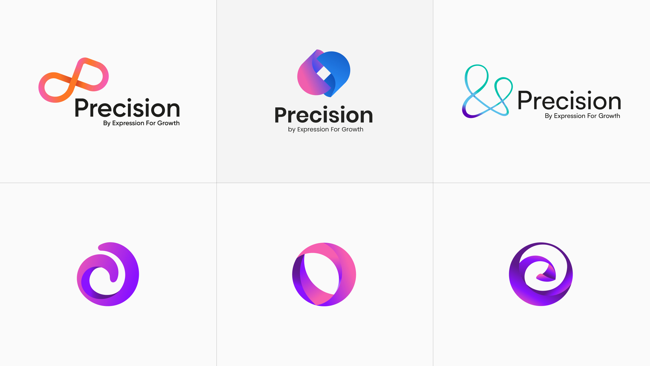
With some fine tuning, we landed on the final brand identities for both Precision and Expression For Growth.
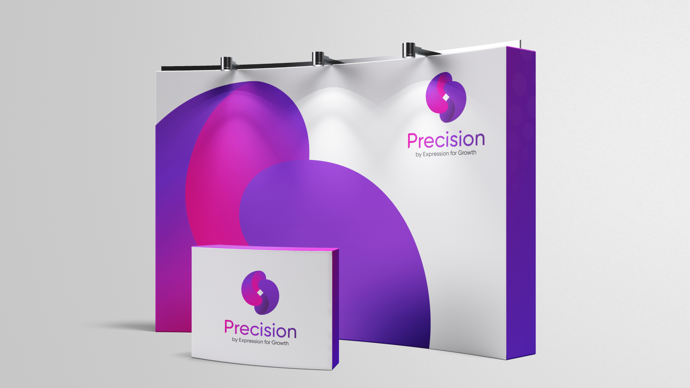
The Precision brand incorporates two ‘quavers’, derived from the ‘P’ letterform, interacting with each other in a revolving manner to symbolise the partnership between client and the Precision training solutions.
The two quavers nest together to create a centralised diamond, a subtle nod toward the Precision brand name.
The final Expression For Growth brand identity depicts an intricate swirling vortex, consisting of circles set at alternating sizes. These layers of condensed energy and clockwise motion gradually reduce to a central vanishing point.
A simplified gradient colour strikes through the entire shape to simulate a 3D feel.
final IDENTITY
The final identity concepts for both Precision and Expression For Growth feature custom type treatment, incorporating the Neue Haas Grotesk as the nearest alternative to Apple’s ‘San Fransico’ typeface.
We sheared and rounded the baselines and cap heights of letterform stems to soften the overall sharpness of the typeface, injecting an element of playfulness into the identities as a whole.
With the final identities solidified, we created complementary iconography artwork for each of the Precision solutions, based on real-life metaphors that facilitators use within training sessions.
The final artwork style bridges the gap between a flat and a physical feel – the base of the icon built using solid shapes and colouring, with extensive shadow and highlighting work layered on top to evoke a 3D form.
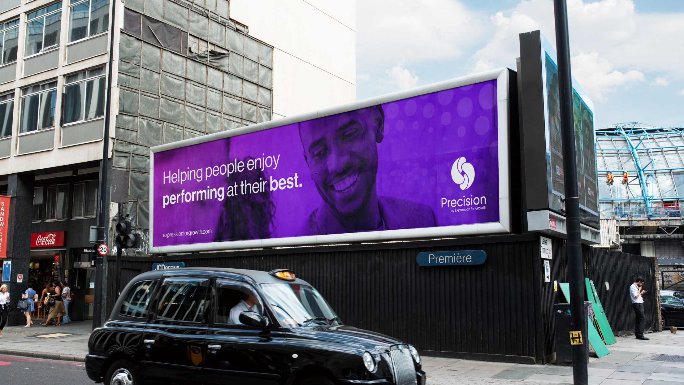
We applied these brand assets and final identities to branded collateral such as workbook layouts, exhibition stands and whitepaper templates.
process wheels
Precision also needed training session collateral for use on large flip charts to help guide their learners through the sessions.
Each Precision solution required its own process wheel, containing individual steps. Along with the overarching metaphor iconography, each process step required its own icon to illustrate the step.
We put forward several directions for style of the icons, and settled on a subtle illustrative brush style to reflect the annotated and human to human interactivity of the training sessions. The icons were not to be overly complex, but retain the right level of detail to successfully illustrate the step. A very delicate balancing act to challenge our designers!

brand values
Expression For Growth required brand assets for use internally and externally.
We designed a series of brand values, injecting the vibrant and custom directional gradients incorporated into the primary brand identities.
The design process was extensive, fleshing out the perfect base theme for each of the icons to ensure they aligned with the value they represented.
The physical 3D look and feel was also to be more prevalent in the brand value icons, taking inspirational cues from an ice sculpture team bonding session, and with the idea of creating physical trophies awarded to employees.


BRAND EXTENSION: THE 5% club
A natural follow on from the brand values work was the 5% Club iconography.
The 5% Club highlights real stories of outstanding sales people who deliver not only good sales experiences, but successful ones.
Several iterations of the icon were explored before settling on the ‘shield’ – a shape evoking bravery and determination and to be worn with pride.
The icon’s artwork style reflects the brand values in terms of its gradient vibrancy, shadow and highlight work to create a physical feel.
summary
To conclude the project, we created a comprehensive set of branding guidelines for Expression For Growth, which also contained guidelines for the Precision sub-brand.
These guidelines serve as a concrete reference point for the brand going forward, enabling them to successfully and consistently roll out their fresh new branding internally and externally.
This is one of Giant Peach’s most extensive branding projects, and both the client and ourselves couldn’t be happier with the results.
We took them from out-dated and inconsistent brand to energetic, mature yet playful, set to inspire the future of commercial training.
